
Problem: 2010-era iTunes support didn’t match today’s iOS-first mental models
Stakes: Users struggled to find billing / subscription help; content felt misrouted
My role: UX/UI + research with Content/Marcom; reorganized IA into billing + content destinations
Outcome: Vast increase in CTR and helpfulness; #1 Google rank for Apple billing queries; fewer support calls
The UX Challenge
Modernize a 2010-era structure into a clear, mobile-first IA that routes users by intent (billing vs. content issue) and lands them on pages that answer the question on the first screen.
What was broken
“Everything is iTunes” = vague scent; users didn’t know where to start
Billing topics were buried among content help
Pages tried to serve everyone and satisfied no one
Who I designed for
Everyday customers: arrive with a single task (“fix a billing issue,” “cancel a subscription,” “why won’t Music play?”)
Support & content teams: need a structure that’s easy to maintain and expand with new services.
My role & scope
Lead UX for IA + page design. Partnered with Content/Marcom to align voice, built prototypes, validated with search and task flows, and defined page templates for ongoing updates.
Solution at a glance
1) Billing becomes its own destination
A clear path for subscriptions, purchases, refunds, and payment methods, separate from content troubleshooting.
2) Content-specific pages
Focused help per service (Music, TV/Movies, etc.) with task-based entry points and canonical answers above the fold.
3) Strong information scent
Plain-language titles, top-task links, and consistent visual patterns so users know they’re in the right place instantly.
4) Scalable templates
Reusable layouts and components so new topics/services slot in without reinventing the page.
Research & iteration
Mapped top queries and help-seeking paths; identified drop-offs where billing/content were mixed
Click-map and scroll behavior informed which tasks needed to be first-screen
Prototype tests compared “combined” vs. “split” IA and split consistently reduced time-to-answer

Key design decisions (and why)
Split by intent (Billing vs. Content): reduces misroutes and pogo-sticking
Task-first modules: start with the 4–6 top reasons people land on the page
Answer on the first screen: short intros, expandable detail
Consistent patterns: same card grids, link styles, and anchor behavior across services
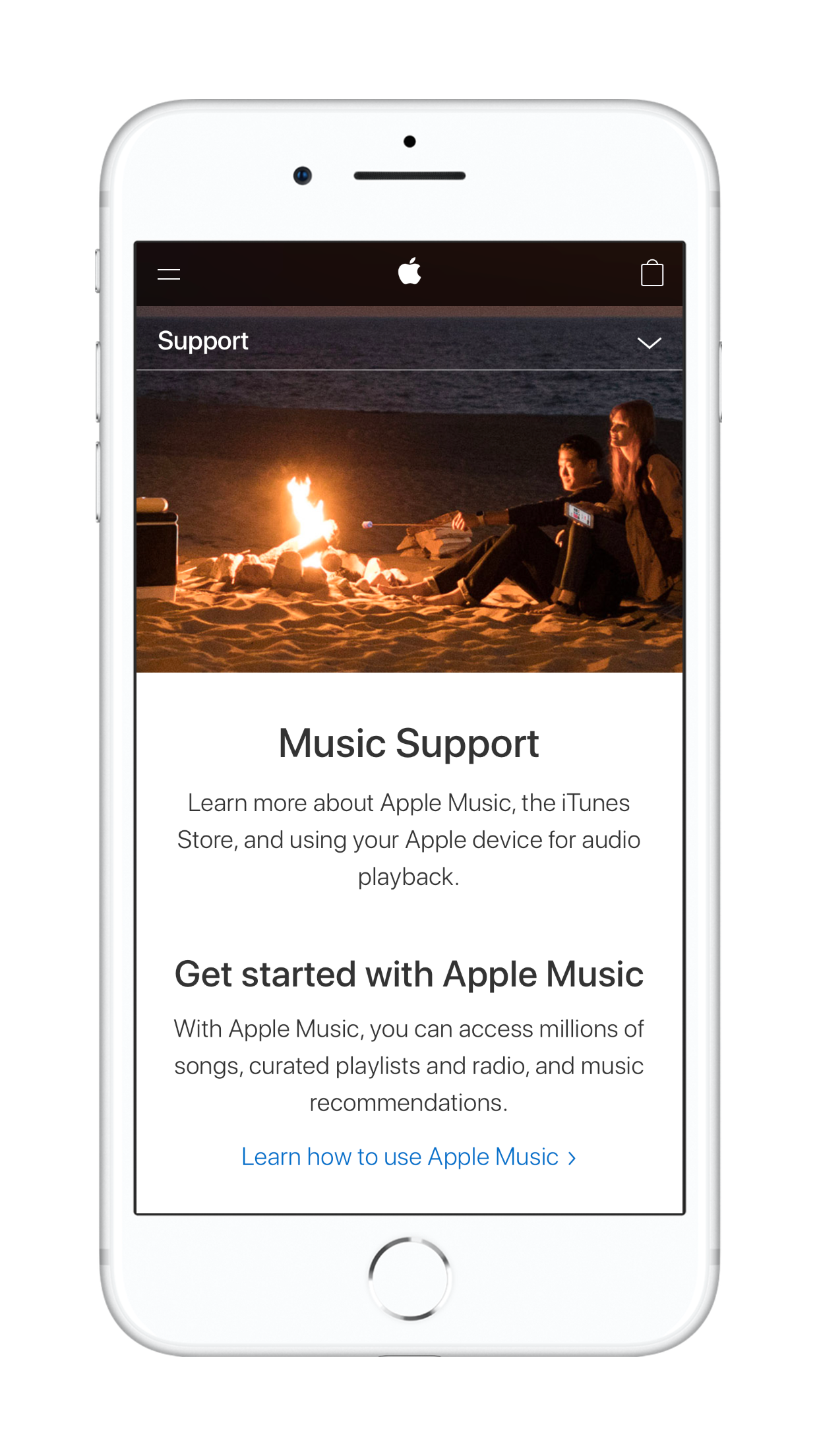
Live page: Music Support


Live page: Apple TV Support
Live page: Apple Music Support
Outcomes & impact
Better findability: clear entry to billing and to each media service
Higher engagement/helpfulness: more users complete tasks without contacting support
Fewer call-ins: clearer routing and first-screen answers reduce escalation
Maintainable at scale: content teams can ship updates into stable templates.
Reflection
This was an IA problem disguised as a content problem. By aligning the structure to how people think (pay vs. play) we made support feel obvious, fast, and modern.
Next steps
Instrument success per task (completion, pogo-stick rate, time-to-answer), expand content-specific diagnostics, and continue tuning titles/descriptions against real search terms.