
About This Project
This is a self-initiated project for practice at iOS app design. The lack of a Landscape view for this app has been a pet peeve of mine for quite some time.
My Role
I did the initial research, wireframing, and paper prototyping.
The Challenge
The iOS Music app does not have a landscape view, and is difficult to use when held or mounted in this position.

While most included Apple apps work well in a Landscape position, most notably iTunes Store and Maps, the Music app does not. It's a frustrating experience.
I decided to focus the study to one use case: iPhone Pluses mounted to a car dash while rotated to Landscape. There were others, like handheld for two-hand typers, but the car mount use case is the one I felt most clearly showed the issue between key apps a driver would likely switch between.
Research & Competative Analysis
What's the "Landscape" of Landscape?
As a driver, the apps you are most likely to use revolve around navigating, entertainment, and communication. These apps should be easy to engage with one-handed and with minimal interfacing necessary to perform the task at-hand.
I dug into the pre-loaded Apple apps in those categories to see how they were handling Landscape. I then looked around at other music-related apps to see the features of the competition.


Key Findings
The solutions so far are not ideal.
Landscape can be done well for apps that a driver would use, but so far in the Music space, the apps either don't have Landscape at all (like Apple Music on iOS, Spotify, NPR One) or implement it in a way that doesn't take into consideration all the elements needed to make a successful car-dash-mounted music app (like Apple Music on CarPlay, Cesium).
- The interface should be clean, free of extraneous buttons and information
- Consideration should be given to grouping actions towards the left side of the screen, as Landscape users tend to mount their phones towards the center of the dash, making the left side more in reach.
- It's still a media-consumption app, so an eye should be given towards making it feel inviting and warm.

The Vision
Make it work, make it Apple.
The Cesium app is a great start, but it doesn't look at all like an Apple app. The spacing is off, there's not really a clear hierarchy, and it just in general feels like they took their Portrait view, chopped it in half, stacked the halves next to each other, and called it the Landscape view.

At least it exists!
It's great that a music app has at least put the effort to make Landscape work, but this leaves a lot to be desired. Everything is there, but it doesn't seem considered. I'd love to talk to Cesium's UI team and see what their pitfalls were here and why they decided on the layout they did. There may have been time, money, or resource constraints I'm not aware of.
I'd like to look towards Apple Maps for an effective car-friendly layout that feels just right.
Wireframing & Iteration
Low-fi iteration to gauge effectiveness
Any iteration needs to consider the elements that are necessary for an effective car-based screen, as I noted in the findings.
My first task was to ride along as a passenger in the car of people I knew that used dash mounts with their phone in Landscape mode, observing how they interacted with their phone while driving.
(As a side note, one of my initial ideas for research was to do a bunch of 20 minute Lyft rides, to get a lot of data quickly. Those hopes were quickly "dashed" when I realized pretty much every Lyft driver mounts their phone in Portrait mode!)
In the course of my observations, I noticed that of all the controls displayed, volume seemed to be the least critical component to display on our use case. The users all (well, mostly) changed the volume using the car's stereo controls, at an almost instinctual or unconscious level.
(One user did use the physical buttons on his phone, but never interacted with the screen volume control, so the point still stands.)
During the observation process, I began to scratch out a few ideas on how to make this work. I then gave the paper to some heavy iPhone music users and asked for their feedback. You can see the beginnings of my deemphasis on volume control reflected in versions B and C below.
A: Start with the idea from Cesium, but clean it up. This wireframe reduces complexity and enables action. It also hews closely to the existing Music app in Portrait, while taking clues from CarPlay.
B. Actions like "Download from iCloud" and "Send to AirPlay Speakers" aren't as necessary to have at your fingers while your driving. In supporting our initial use case, those were dropped in favor or Shuffle and Repeat.
C. Album art is great, but it's "color" for the main info and actions. So this wireframe reduces the art footprint and dedicates that real estate to longer titles and a few functions. Everything else is a click away.
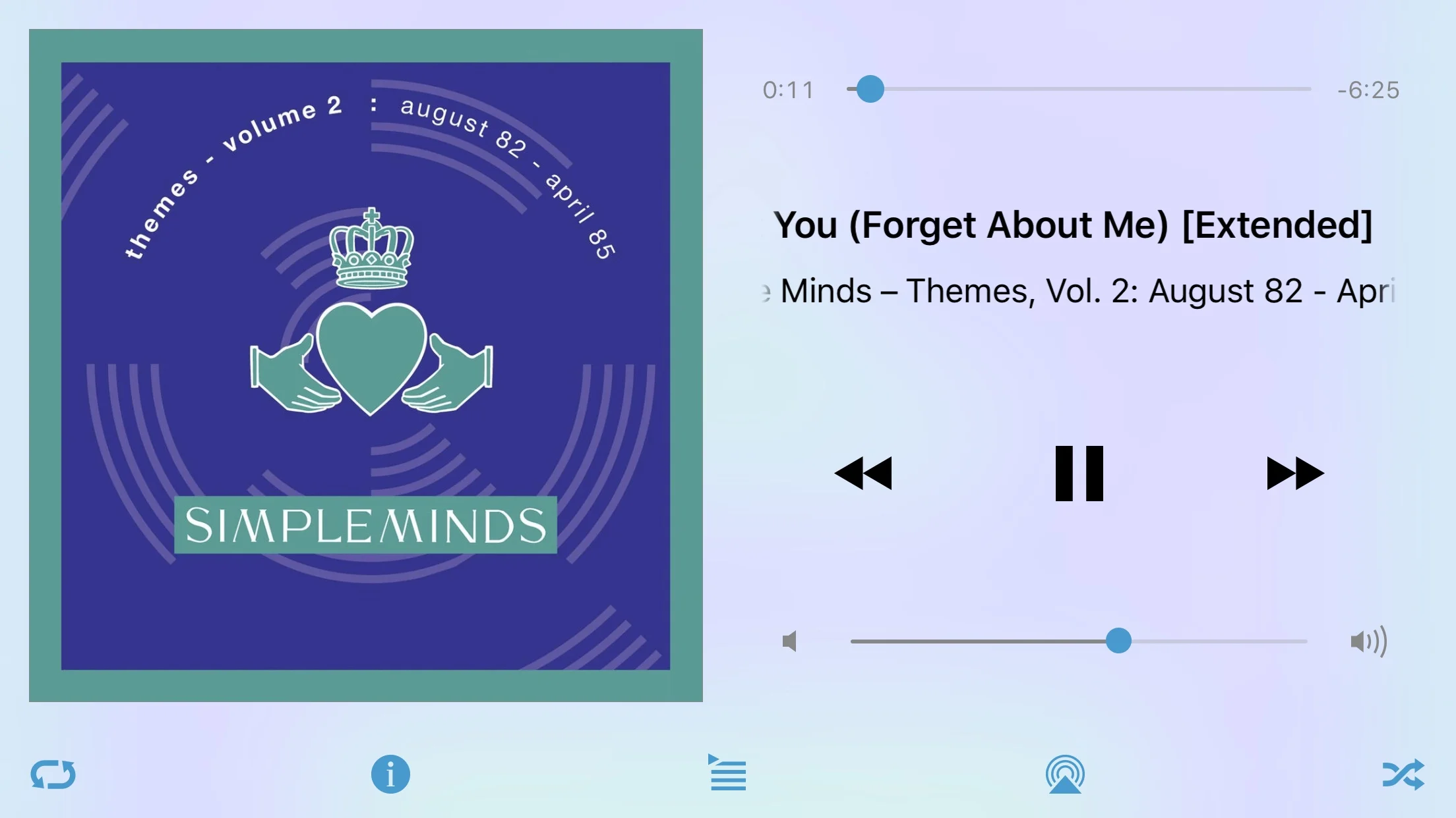
MockuP
Rich visuals with max usability.
Wireframe #3 was preferred by those I tested with, so I based the mockup off of that.

Key features:
- Everything has it's own space, and plenty of room to allow for mishits while distracted or being jostled
- Instead of a top-level link to AirPlay, I put in a (placeholder) icon to indicate access to Up Next. This gives the user a quick view of what songs are coming up.
- Black is a good color around artwork, because it increases the perceived contrast. I used that as a panel to set the artwork and other controls off from the main body.
Coming soon: quick prototype of the screen in action