
Problem: No shared library / design system; constant visual inconsistency and rework
Stakes: Slow delivery, fragmented patterns, accessibility risk
My role: Created component set & rules, enforced WCAG, drove Adobe XD to Figma migration
Outcome: 2× output; scaled from 1 to 7 teams; consistent, accessible UI
The UX Challenge
Create a design system that’s simple enough to adopt quickly and rigorous enough to raise quality across multiple products—without slowing teams down.
What was broken
Re-invented UI per project; inconsistent states and behavior
Accessibility gaps (contrast, focus, keyboard, SR labels)
Designers blocked on handoffs; engineers guessing specs
Who I built it for
Product teams that need to ship faster with fewer debates about basics
Designers who want flexible, documented patterns in Figma
Engineers who need stable specs, tokens, and usage rules
My role & scope
Led system definition and delivery: inventoryed patterns, defined tokens, built Figma components & variants, wrote usage guidelines, established contribution+governance, and partnered with eng on mappings to code.
Solution at a glance
1) Tokens first
Color, spacing, radius, type, and motion tokens for consistent theming and dark-mode readiness.
2) Accessible components
Buttons, inputs, lists, tables, modals, etc: each with states (hover/focus/active/disabled), annotations, and AA/AAA contrast.

A selection from the Dialogs artboard in the Figma file.
3) Real-world variants
Density, size, icon/no-icon, secondary, mid-validation… so teams don’t hack one-offs.
4) Usage rules, do’s & don’t’s
Short, visual guidance: placement, copy, error patterns, keyboard flows.
5) Contribution model
Lightweight proposal to review to iterations in versioning; keeps quality high while allowing the library to grow.
6) Figma mapping to code
Naming and properties align with tokens/components in code to reduce drift.
Research & iteration
UI audit across products to find the 20% of patterns driving 80% of screens
A11y review (contrast, focus order, SR naming) to set the default bar
Pilot with two teams, then rolled to more. Feedback tightened props, variants, and docs
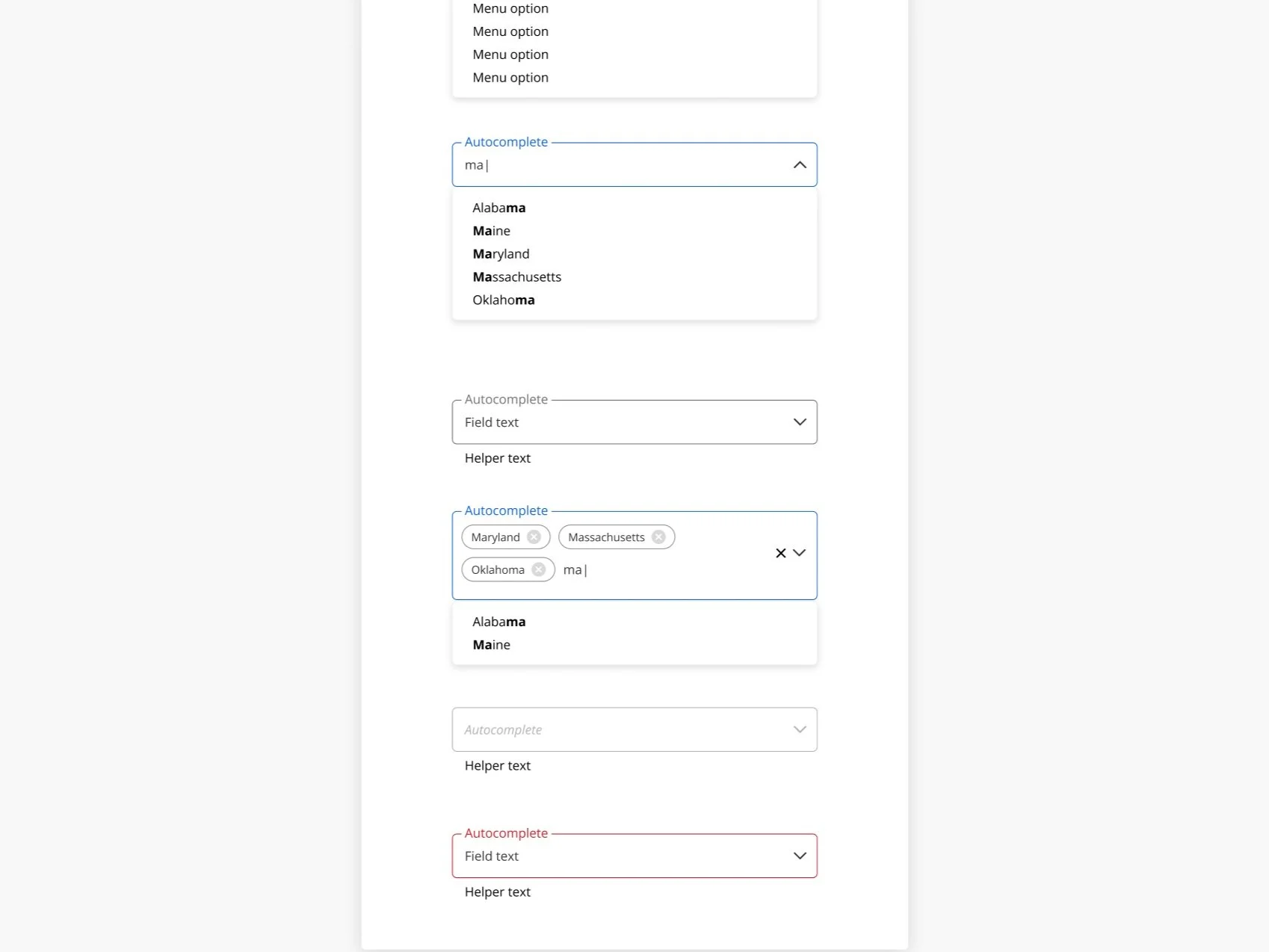
A selection from the Autocomplete artboard from the Figma file.
Key design decisions (and why)
Tokens before components: easier theming, fewer visual inconsistencies
Variants not overrides: predictable behavior, faster assembly
State diagrams in the spec: eng understands logic, not just pixels
Doc cards embedded in Figma: guidance stays where designers work
Contribution path: adoption stays high because teams can influence the system
Outcomes & impact
Throughput up ~2×: fewer net-new mocks; faster reviews
Adoption from 1 to 7 product teams: shared patterns, less debate
Accessibility baseline: AA (often AAA): contrast, focus, and SR labels by default
Handoff friction down: tokens/props map straight to code; fewer build questions
Artifacts
Figma files for the EADP XD UI Component Library

Guidelines for buttons from the Figma file.